Browse Lighthouse
Reimagining category pages
Company
Wayfair
Role
Product Design Lead
Year
2019

About the project
Wayfair's office proudly displayed the motto "Zillion Things Home" on its walls, presenting a compelling challenge of curating a wide range of products. The problem was that the bounce rates were high on the product grid pages, where users were browsing products.
The goal was to improve the product grid page by enabling the users easily navigate through zillions of products and find products they are looking for to make an informed purchasing decision.

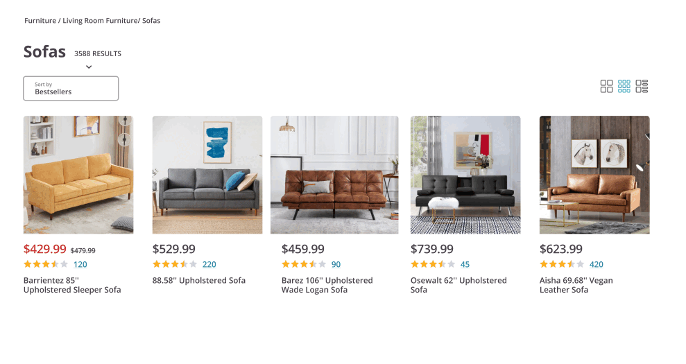
Product category page (old)
Discovery
I conducted an in-depth analysis of previous research and then facilitated an assumption mapping exercise to identify the most common user needs and challenges.
Findings
1) Product Card Metadata
Users were feeling overwhelmed due to the volume of information on product cards resulting in high bounce rates.
2) Filters
The filters were not easy to understand and there was a lack of guidance to assist the users resulting in low engagement.
3) Outdated look & feel
The overall look & feel didn’t convey a modern aesthetic, failing to reflect the modern products Wayfair was carrying, resulting in low user trust.


Assumption mapping exercise
Product cards and filters
Ideation
I facilitated ideation sessions with designers who owned different stages of the purchasing funnel. We focused on simplifying the product cards and finding ways to guide and inspire the users.


Opportunities
Simplifying the product cards
The results of an online card-sorting exercise with 300 users showed that the most important metadata was price, product title and user reviews. I redesigned the product card to display only the most important data and on hover I enabled the users were able to reveal the remaining metadata.
Guiding the users
Highlighted the filters with images and introduced pro tip cards tailored for each category to help users learn more about the product category. Aso used a sliding user reviews modal to enable the user easily go through the user reviews.

Product card hover state explorations

Visual filters & pro tip cards

User review side modal
Outcome
After testing each concept with 10 users, I designed the Northstar for browsing experiences. Additionally, removed the list view due to low engagement, introduced responsive grid and combined sort and filter.


Before
After
